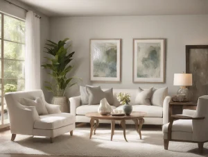
Hey friends! Chris Walker here. Today, we’re diving deep into something that’s often overlooked but can make a world of difference in our day-to-day lives: the impact of color psychology on our mood, especially in the comfort of our own homes. Grab a cup of your favorite beverage, and let’s chat about how you can use color to create a more uplifting, calming, and overall happier living space.
Understanding Color Psychology: A Quick Primer
Before we jump into the nitty-gritty of how to use color to enhance your mood, let’s do a quick recap of what color psychology is all about. Basically, color psychology is the study of how colors affect our emotions and behaviors. It’s fascinating because colors can influence our feelings without us even realizing it. Imagine that!
Ever noticed how you feel more relaxed in a room with soft blues and greens, or more energized in a space with bright reds and yellows? That’s color psychology at work. Each color has its own unique vibe and can affect us in different ways.
The Power of the Primary Colors
Let’s start with the basics. Primary colors—red, blue, and yellow—are the building blocks of all other colors and each has their own psychological effects.
Red: The Energizer
Red is the color of passion and energy. It’s bold, it’s vibrant, and it can really get your adrenaline pumping. If you’re someone who needs a little extra motivation, consider incorporating red into your home office or workout space. Even small touches, like a red chair or some red artwork, can make a big difference.
But be cautious! Too much red can be overwhelming and may even cause anxiety. Use it sparingly to reap the benefits without feeling like you’re living in a fire engine.
Blue: The Calm Collector
On the other end of the spectrum, we have blue—a color that’s all about peace and tranquility. Blues are perfect for spaces where you want to relax and unwind, like the bedroom or bathroom. Soft, muted blues can make a room feel like a serene oasis, helping to reduce stress and lower blood pressure.
Just a heads-up though, too much blue can sometimes come off as cold or uninviting. Balance it out with some warm accents to keep the space cozy.
Yellow: The Happy Helper
Yellow is like a ray of sunshine in your home. It’s cheerful, warm, and can instantly lift your spirits. This is a great color for kitchens and dining areas where you want to create a lively, welcoming atmosphere. Yellow can make these spaces feel brighter and more inviting, encouraging social interaction and good vibes.
However, like red, yellow should be used in moderation. Too much yellow can be jarring and may even cause feelings of frustration. A little splash here and there can go a long way.
Exploring Secondary Colors
Secondary colors—orange, green, and purple—are just as important and can offer a nuanced approach to enhancing your mood at home.
Orange: The Social Butterfly
Orange combines the energy of red and the happiness of yellow. It’s a warm, inviting color that’s perfect for social spaces like the living room or dining area. Orange can stimulate conversation and create a lively, friendly atmosphere.
If you’re hesitant to go all out with orange, consider using it in smaller doses—think throw pillows, rugs, or accent walls. It’s a great way to add some zest to your space without going overboard.
Green: The Natural Nurturer
Green is the color of nature and represents balance and harmony. It’s incredibly versatile and can be used in almost any room. Green is particularly good for spaces where you want to promote relaxation and well-being, such as the bedroom or home office.
One of the best ways to incorporate green is through plants. Not only do they add a pop of color, but they also improve indoor air quality and bring a bit of the outdoors inside.
Purple: The Creative Maven
Purple is often associated with creativity, luxury, and spirituality. It’s a color that can inspire and energize the mind, making it perfect for creative spaces like an art studio or a reading nook. Lighter shades like lavender can also bring a sense of calm and relaxation, making them ideal for bedrooms.
If you’re looking to add a touch of elegance to your home, deeper shades of purple like plum or eggplant can create a rich, sophisticated atmosphere.
Neutral Colors: The Unsung Heroes
Neutral colors like white, gray, and beige might not be as flashy as their more colorful counterparts, but they play a crucial role in home design. These colors are incredibly versatile and can serve as the perfect backdrop for any decor style.
White: The Clean Slate
White is all about purity and simplicity. It can make a space feel open, airy, and clean. White walls are like a blank canvas, allowing you to easily switch up your decor whenever the mood strikes. Plus, white reflects light, making rooms feel brighter and more spacious.
However, too much white can sometimes feel sterile or cold. To avoid this, add some warmth with textures and accent colors.
Gray: The Balanced Beauty
Gray is a fantastic neutral that can add depth and sophistication to any room. It’s incredibly versatile and can be either warm or cool, depending on the undertones. Gray works well in living rooms, bedrooms, and even kitchens.
To keep gray from feeling too monotonous, pair it with vibrant accents or different shades of the same color.
Beige: The Cozy Companion
Beige is warm, inviting, and incredibly versatile. It’s a great neutral that can make any room feel cozy and comfortable. Beige pairs well with almost any color, making it a great choice for living rooms and bedrooms.
To keep beige from feeling too bland, mix in different textures and patterns to add some visual interest.
Combining Colors for Maximum Impact
Now that we’ve covered the basics, let’s talk about how to combine these colors to create a balanced and mood-enhancing home.
The 60-30-10 Rule
One of the easiest ways to create a harmonious color scheme is to follow the 60-30-10 rule. This rule suggests that you use three colors in your decor:
- 60% of a dominant color (usually a neutral)
- 30% of a secondary color (a complementary or contrasting color)
- 10% of an accent color (a bold or vibrant color)
For example, you might have a living room with 60% beige (walls and large furniture), 30% teal (curtains and rugs), and 10% coral (throw pillows and artwork). This creates a balanced, cohesive look that’s easy on the eyes and uplifting for the spirit.
Color Blocking
Color blocking is another fun way to incorporate multiple colors into your home. This technique involves using large blocks of contrasting colors to create a bold, dynamic look. It’s perfect for accent walls, furniture, and even art.
For instance, you could paint one wall in your living room a deep navy blue and then add mustard yellow cushions and a burnt orange rug. The contrasting colors create a vibrant, energetic space that’s sure to boost your mood.
Monochromatic Schemes
If you prefer a more subdued look, consider a monochromatic color scheme. This involves using different shades of the same color to create a cohesive, elegant space. For example, a bedroom with varying shades of blue—from a deep navy bedspread to soft sky-blue walls—can create a serene, calming atmosphere.
Personalize Your Space
At the end of the day, the colors you choose should reflect your personal style and preferences. Don’t be afraid to experiment and have fun with it. Your home is your sanctuary, and it should make you feel happy and comfortable.
Remember, there are no hard and fast rules when it comes to color. What matters most is how the colors make you feel. So go ahead, mix and match, try different combinations, and find what works best for you.
Final Thoughts
Using color psychology to enhance your mood at home is a simple yet powerful way to create a living space that truly feels like your own. Whether you’re looking to create a calm oasis, a lively social hub, or a creative retreat, the right colors can make all the difference.
So, my friends, I hope you’re feeling inspired to give your home a colorful makeover. Remember, even small changes can have a big impact. Don’t hesitate to start with a few accent pieces or a fresh coat of paint. You’ll be amazed at how much brighter and happier your space—and your mood—can become.
Until next time, happy decorating!


